Artist inspiration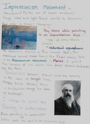
|
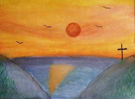
Always Shining
38.1cm by 27.9cm
Watercolor on paper September, 2017 Exhibition text: "Always shining" was created to represent a loss of a dear friend and how his smile always brightened up a room. Although he is gone he will never be forgotten and the little things in life such as the sunrise will always remind me of his want to make everyone happy and to always be a helping hand. “Always shining ” is a watercolor painting, inspired by the impressionism movement and my own photos. Meaning
“Always Shining” was created as a tribute to a friend that was killed over the summer. People's lives are always changing and we can’t control what will happen in future. The lost of my friend changed many lives as he was taken from this world way too early. One early morning I was watching the sun rise and the bright beautiful color reminded me of the way my friends smile always brightened up a room. Although he is gone he will never be forgotten and the little things in life such as the sunrise will always remind me of his want to make everyone happy and to always be a helping hand. “Always Shining” is my way of remembering that as the days go by it might not be as hard to cope with, but as the sun rises he will still be bringing light into the room.
|
Inspiration photos
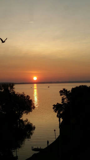
This picture inspired me to create the mountains in my painting. The picture has trees that are black so instead of trees I used hills. I also lightened them up as i did not want my bottom corners black like in the photo. I also got the ideas of flying birds. My birds are not ass detailed as the closer on in the picture because I wanted to create the illusion that the birds were farther away/ higher in the sky.
|
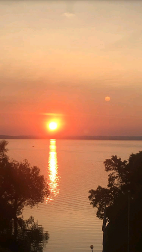
This picture gave me the idea for the sun. I really loved how I captured the bright, radiant sun in this picture. I wanted to reflect that into my painting. I wanted the sun to be of of the first things that people looked at my painting just like in the picture. I was inspired by the way the sky and water met in the background and tried to resemble that in my painting. In the bottom right corner is a light pole that made me come up with the idea for the cross on the mountain. The way that the sun reflected in the water caught my eye and I knew that the reflection in the water was essential for making “Always Shining” complete.
|
Planning
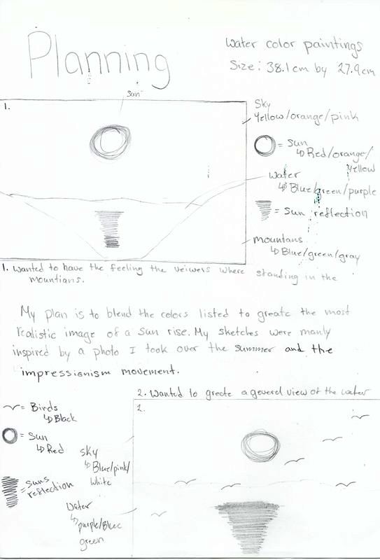
Process
In creating “Always Shining” I looked up artist to inspire me to create my final product. I landed on using and some of my own photography as inspiration. From there I created my planning sketches. I realized that the a lot of my playing sketched reminded me of my friend, I ended up dedicating “Always Shining” to him. I dis sided that I wanted to work with watercolors as it’s not a medium that I have used before. This in full created challenges for me. After doing research on how to paint with watercolors I started working on my painting. I started out my project by soak my watercolor paper for about 5 min. I soaked the paper first so it would absorb the base coat of paint making it easier to blend the sky and water. Soaking it also causes the paper to expand slightly so it does not buckle. I laid down a base color of light blue and added colors to it to get the water as close to realistic as I could. Water are has a lot of movement, while painting the water I let the paint do what it wanted. In my research and experimentation I gained the skill to change the hue of the color through the amounts of water. I would not only mix the paint together to get new colors but I layered the colors to create dimension in the sky and water.I also used a blue yellow color to create the line where the water and the sky meets. It was hard to do as yellow and blue green color does not always blend well together. I used a darker blue to give the water some depth. I messed up so instead I used the dark blue green color to make mountains in the corners bigger than planned. This also created the appearance that the viewer was standing in the mountains. To make the mountains more like mountains I added patches of grass. I wanted to add little trees or cattails. I chose to do grass because it was hard to create the proper proportions for the trees. The cattails would have been a cool detail but because of the color of the mountain I did not think that views would have known what they were. I put grass and player the grass with really bright green and dark rich green to give the grass depth. I had plan out the grass and what brush that would work best to create the proper lines that would resemble grass. I then flipped the paper around to work on the sky. I used a picture that I took over the summer to help me create the look for the sky. I used a lot of yellows, oranges and pinks because they were the colors that I found in the picture that I took. The sky was harder to make as it needed multiply layers. I wanted to really showcase the bright orange sun so I needed to paint that last. Painting this last not only gave it a base color to start with but it made the color more vibrant. While painting this I found that my product was not as similar to the inspirations that i would have liked and it lacked a strong connection to the meaning. I changed that by working the paint in ways to be similar to the inspirations. I added details that were not present in the planning sketches to help make a stronger connection to the meaning. I struggled with making the think lines for the birds and cross. I had to use a very small brush and gather paint on it. Then let it dry a small bit making it easier to make the dark black straight lines.
|
ExperimentingProcess photosReflectionIn creating my final painting I had to face many challenges. To keep from the paint all blending together I needed to let layers dry and add on later. This way I not only was creating dimension but was able to blend the colors easier. Through this process I found it hard to mix water colors to create the color I wanted before I put it on the paper. I did like the fact I could control the thickness of the paint as it was added to the paper, It made it easier to draw the lines with the paint less diluted. I had to go back and add things in the end after comparing it to the inspiration and the meaning of my piece. I saw that it was hard to see that it was a tribute to someone that had passed away. I added a cross to add that religion factor of losing someone. To create a stronger connection between my inspiration I added the reflection of the sun in the water and added the flying birds. After adding these factor to my final product I felt that it created a stronger connection. I could have created an even stronger connection between the two but I loved the way that “Always Shining” turned out.
|
ACT Connection
- “Always Shinning” is similar to its inspirations through the use of colors and the similarity in subjects, and objects found in the photos taken and the style from the impressionism movement.
- My inspiration, inspired me to create a watercolor painting as a tribute to a friend that was killed. “Always Shinning” represent the way that his personality brightened up a room every time he walked in.
- When researching my inspiration I came to the conclusion that the impressionism movement was to get away from always having perfect final product. That something “messy” can still be beautiful.
- The central idea around my inspiration research was finding a way to showcase my friends bright personality through watercolors.
- The inferences that were made when reading my research was that the artist in the impressionism movement wanted to change things up. The short bruck strokes and un clean edges gives the piece more movement and life.
