Flight to Freedom
|
20cm by 24 cm
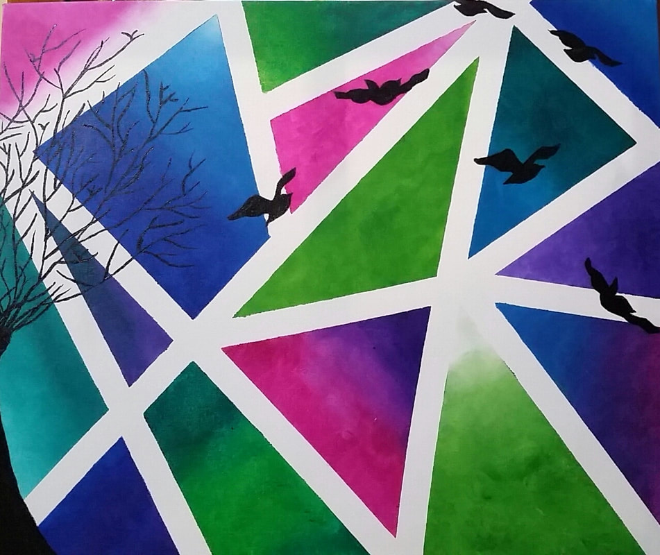
Acrylic in canvas December, 2017 Exhibition text: “Flight to freedom” is a 20cm by 24cm acrylic painting inspired by Diane Bolinger and the post impressionism movement. “Flight to freedom” is a painting created to express the time that the baby bird moves out of their mother's nest to start a life of their own. The use of colors and the symbol of the birds reflect the feeling of the artist i transition into a scary yet independent life away from home. |
|
Inspiration
|
|
My artist inspiration for “Flight to freedom” was Diane Bolinger and the Fauvism movement. Bolinger is an artist that uses different medium in her work. She uses watercolor, acrylic and photography. The post impressionist movement inspired me to use of nature and bright colors to relay the artist emotions and feelings. These two inspirations lead me to try a new style play with contrasting colors and the use of gradation in the painting.
Meaning
As the year is coming to a close and the idea of going off and starting a new and independent life away from my mom and dad is scary yet could not have came sooner. Just like a baby bird moves out of their mother's nest to start a life of their own. It might be a scary thing to think of but if you don't take that leap of faith they just like the baby bird you will never know what could be out there beyond the nest.
|
planning
|
This plan had was to have one large tree that is centered on the middle of the canvas. Around the canvas there would be hills and a bird sitting on the tree. This plan would be similar to Diane Bolinger's “ Cheryls fire tree” the difference would be that the tree would not have the color of the leaves in the background, also the colors would not be and worm and spring like. Because the tree has not leaven it shows winter with a lot of purples and blues.

|

In this plan there are different geometric shapes with different shaped of blues, purples, and pinks. On top of the that in black will be tree silhouettes with flying birds around it. This will be similar to “Holiday inn” by Diane Bolinger.
|
|
In plan three there will be the geometric shapes in the background similar to plan two. The colors in the geometric shapes are different shades of pinks blues and purples. On the left hand side there is a tree that is leafless. There is one bird in the nest and birds flying away. The tree and birds will be black as if they were silhouettes.

|

This plan is a mix between plan two and plan thee. It will have the geometric shapes in the back there will be tree silhouettes at the bottom and a wire with two birds sitting on it.
|
Process
|
Process/ Experimentation photos
|
|
I started this project by sketching up the different plans for the project. I picked the fourth sketch because it showed my meaning through the birds the geometric shapes. I then stretched out 2 different a 2.54cm by 2.54cm and a 20 cm by 24 cm. The 2.54cm by 2.54cm was used to practice the geometric shapes and to play with different gradients and colors that would match. I took painters tape and made different shapes. I then took sponges to help make the different gradients and to create a texture. Through this I found that I liked the green, blue, pink and purple colors. I then waited until the paint had dried to pull the tap up. After pulling the tape up i found that some of the paint got through the tape not making lines straight. I then did the same thing to the larger canvas. When I put the tape down the second time I used a ruler to push down the tape to make sure that all of the tape is stuck down tightly. When I put on the different gradients I tried to make the darker parts on the outside of the canvas and lighter towards the center. I also tried to have is so none of the same color were near each other. I used the same technique that I used for the smaller canvas. I let the paint dry overnight then slowly removed the tape this time I did not have any of the paint seep through the tape. I then used a pencil and sketched out my tree and the birds. I made some changes by taking away birds from the sky and having one or two more birds in the tree. Giving the illusion that all the birds were in the tree and were flying away. After drawing my plan with pencil I went back and painted the trees and the birds in black.
|
|
Compare & Contrasts
The inspiration and my final project are not similar at all. Diane Bolinger does a lot of landscapes with tees, My painting does not have a landscape it is more focused on the geometric shapes in the background. There is a similarity with the use of trees but Bolinger uses then as a main focus in her painting where the birds are the main focus in my painting. The colors are similar in the sense that Bolinger used gradients to in her painting from light to dark and I used that in my geometric shapes.

|

|
Reflection
Overall I liked the way that this project turned out. It does not have a strong connection to its inspiration because the inspiration only led me to the idea it did not directly influenced my painting. There was a lot of trial and error that took place through this project. I saw a technique on how to make gradients on nails with a sponge and took that and applied it to this painting on a larger scale. When practicing on the smaller canvas I figured out the best way to apply the paint to the sponge and then how to transfer that to the canvas. I took the struggles that I had on the fist canvas and made changes when painting on the larger canvas. I also played around with different styles of birds to find the best for my painting. I liked the the way that the geometric shapes turned out but I wish I would have used lighter or softer colors because once the black was applied it was harder to see the birds in the some spots. This project in my mind does reflect the meaning and the reasons behind the painting. I tried to us similar warm colors like Bolinger uses but wanted to reflect what the parents might feel or the siblings might fell through the cool colors. The colors in my painter were chosen based on the emotions I wanted to reflect through my final painting.
ACT Connection
- The inspiration affected my work through used of colors to express emotions and the use for nature to tie the painting together.
- My artist inspiration led me to think about the expression “ an empty nest” which lead me to think about how my parents will start to feel one I go off to college.
- When researching my inspiration I came to the conclusion that Bolinger’s use of intense color was a driving force for describing light and space. The used pure colors and forms as a way of communicating her emotional state.
- The central theme around my inspiration what to find a way to convey two sides of a story the excitement of the baby bird (me) moving away and starting its own life with the feeling of lose that the adult birds had ( my parents) as there little baby bird is all grown up.
- The inferences that were made when reading my research was that Bolinger used strong and pure colors to express feeling and the images she saw.
